8 Popular Time Management Charts and How They Work
Pick the right time management chart for planning, tracking, or diagnosing lost hours. See when to use each chart for better time management at work.

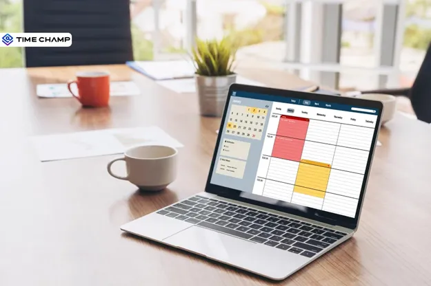
Managing time effectively becomes much easier when you can see your schedule, tasks, and priorities in a visual format. That is where time management charts can help. Instead of relying on scattered notes or lengthy task lists, these charts give you a structured way to plan activities, organize workloads, and stay focused on what needs attention first.
Different time management charts serve different purposes. Some help you schedule work across a timeline, while others make it easier to track progress, balance responsibilities, or identify where your time is being spent. Choosing the right chart depends on how you plan, monitor, and manage your daily workload. In this guide, you will see eight popular time management chart types, how they work, and when to use each one.
What Is a Time Management Chart?
A time management chart is a visual tool used to organize tasks, schedule activities, allocate time, and monitor progress within a specific period. Instead of managing work through scattered notes or long task lists, it presents information in a structured format that makes priorities, timelines, and responsibilities easier to see and manage.
Different types of time management charts serve different planning needs. Some help you schedule tasks across days or weeks, while others help you track progress, balance workloads, or identify how you spend your time. These charts present information visually, making it easier to stay organized, maintain focus, and keep work moving according to plan.
Did you Know?
Visual charts make it easier to manage tasks because you do not have to remember everything at once. The chart shows priorities, timelines, and progress in one place, allowing you to focus more on completing the work. This is why pilots use cockpit displays, doctors use vital sign monitors, and high-performing teams use Gantt charts and burndown charts instead of long status meetings.
8 Visual Time Management Charts to Plan, Track, and Improve Your Time
Below are some of the most widely used time management chart templates that help you plan work, monitor activities, and make better use of your time.
1. Gantt Chart
A Gantt chart is one of the most popular time management charts for planning and scheduling work over a specific timeline. It displays tasks as horizontal bars, making it easy to see when each activity starts, how long it will take, and when you need to complete it. It can also show task dependencies, milestones, and overall progress in a single view.
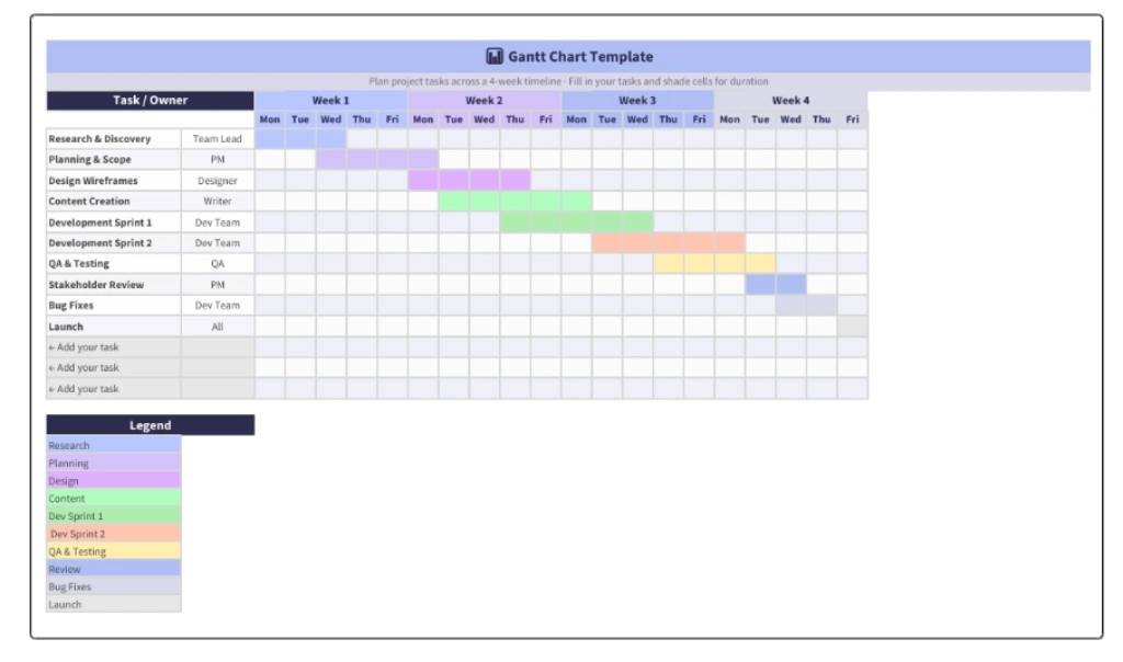
Best For: Project managers, agencies, software teams, and anyone managing multi-step work with deadlines and dependencies.
How to Use: List every task in the project. Set start and end dates for each. Identify which tasks depend on others. Update the chart weekly as tasks fall behind schedule or finish faster than expected.
Pros: Shows the entire project at a glance and helps identify task dependencies before they affect the schedule.
Cons: Can be too detailed for personal task management. Needs regular maintenance to stay accurate.
2. Calendar Heatmap
A Calendar Heatmap is a visual chart that displays activity levels across days, weeks, or months using different colors. Darker shades usually represent higher activity, while lighter shades indicate lower activity. This makes it easy to spot patterns in how you spend your time without reviewing detailed schedules or reports.
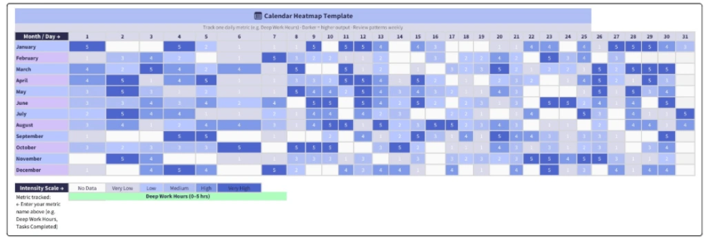
Best For: Anyone who uses time tracking to understand how they spend their hours, spot productivity patterns, and improve planning over time. It is also useful for tracking project hours and workload across different tasks.
How to Use: Pick one metric to track, such as focused work hours, tasks completed, or project progress. Record the daily value. Plot it as a grid with color intensity reflecting the value. Review it weekly to identify patterns.
Pros: Helps you identify patterns that are easy to miss in daily task lists. And gives a clear visual view of your consistency over time.
Cons: Requires regular tracking and updates. It becomes more useful after at least 4 weeks of data.
Pro Tip
Most knowledge workers do their best work on Tuesdays and Wednesdays. The calendar heatmap will show this within a month of consistent tracking. Use it to schedule your most important work on your best days.
3. Weekly Time Map
A Weekly Time Map is a time management visual chart that shows how you distribute your time across an entire week. Unlike a daily schedule, it helps you view recurring activities, work commitments, personal responsibilities, and available time in one place. This makes it easier to identify overloaded days, balance responsibilities, and build a more sustainable routine.
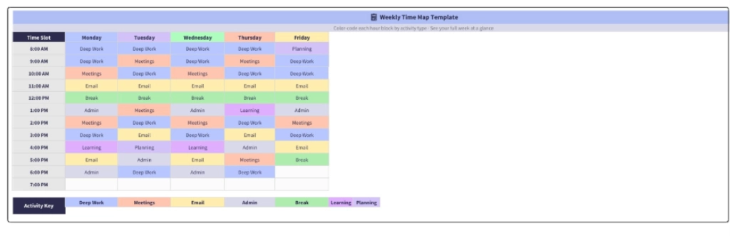
Best For: Anyone designing a sustainable weekly routine, balancing multiple responsibilities, working shifts, or managing work alongside personal commitments.
How to Use: Create a 5x12 grid that covers five weekdays and twelve working hours. Assign a color to each activity type and fill the corresponding time blocks. At the end of the week, compare what was planned with what actually happened and adjust your schedule where needed.
Pros: Provides a complete weekly view in a single chart and helps reveal patterns such as low productivity periods or consistently busy time blocks.
Cons: Requires weekly updates to remain useful and may be less practical for sharing across teams than project-focused charts.
4. Time Audit Pie Chart
A Time Audit Pie Chart shows how you spend your time across different categories, such as deep work, meetings, email, administrative tasks, and breaks. You can use it to analyze a day, week, or month, depending on what you want to evaluate. It displays time usage in visual segments, helping you see where your hours actually go and identify areas that may need adjustment.
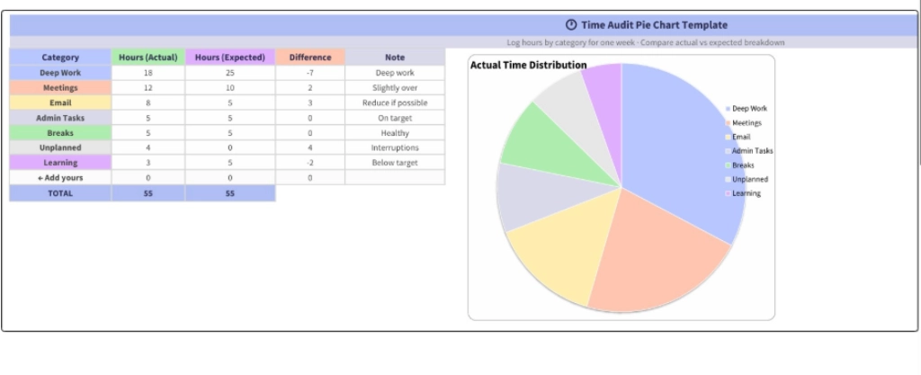
Best For: Anyone who feels they are wasting time but unsure where it is going. It is also useful for team leaders reviewing productivity patterns and freelancers who need accurate records for client billing.
How to Use: Track your time across different activity categories for one full week. Plot the results as a pie chart and compare them with how you expected to distribute your time. The biggest differences often highlight the areas that need attention.
Pros: Reveals hidden time usage patterns and provides objective data instead of relying on assumptions.
Cons: Results are only as accurate as the data collected. Manual tracking can become unreliable without a proper tracking system.
Stop guessing where your team's hours go.
Time Champ tracks every hour and maps it to projects and tasks automatically.
5. Habit Tracker Grid
A Habit Tracker Grid is a simple visual chart that helps you monitor recurring habits over a set period, usually a month. The grid displays habits on one axis and dates on the other, allowing you to mark each day you complete a habit. Over time, it becomes easy to see which routines are becoming consistent and which ones need more attention.
Best For: Anyone building productivity habits such as deep work, exercise, journaling, or daily planning. It is also useful when testing new time management techniques and evaluating which habits are becoming part of your routine.
How to Use: Select four to six habits you want to develop. Create a grid for the next thirty days and mark each habit when you complete it. Review the grid weekly to identify which habits you perform consistently and which ones you skip regularly.
Pros: Visible streaks can increase motivation and make progress easier to track. Missed days stand out immediately rather than going unnoticed.
Cons: Motivation can drop when you break a streak. It works best with four to six habits, as tracking too many habits can make the system difficult to maintain.
6. Energy Curve Chart
An Energy Curve Chart is a line chart that shows how your energy and focus levels change throughout the workday. Many employees experience higher energy during mid-morning, lower energy after lunch, and a second period of higher focus later in the day. However, these patterns vary from person to person. Mapping your own energy curve helps you understand when you are most focused and allows you to schedule important work during your strongest hours.
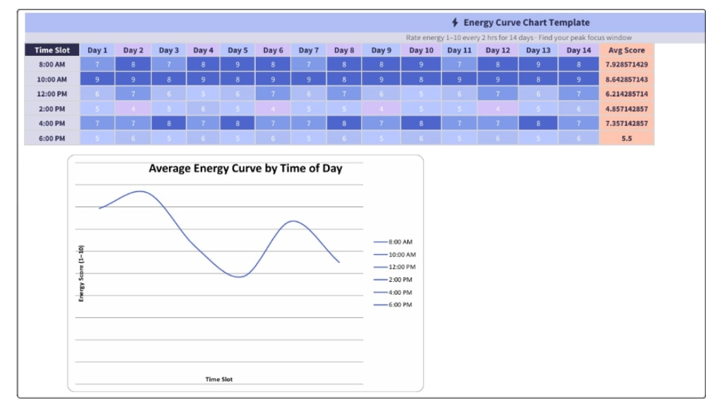
Best For: It is particularly useful for writers, designers, analysts, developers, and leaders who want to plan their schedules around actual energy levels rather than assumptions.
How to Use: Rate your energy level from one to ten every two hours for fourteen days. Calculate the average scores and plot them on a chart. The resulting curve will show the best times for focused work and the periods better suited for routine tasks.
Pros: Helps protect your most productive hours for important work and turns energy into a practical planning factor.
Cons: Depends on an honest self-assessment. Daily fluctuations can occur, so long-term averages are more useful than individual readings.
7. Burndown Chart
A Burndown Chart shows how much work remains in a project, sprint, or goal over a specific period. It includes an ideal progress line that reaches zero by the deadline and an actual progress line that reflects the work completed so far. Comparing these two lines makes it easy to see whether work is progressing as planned or starting to fall behind schedule. It is a widely used project time management chart for tracking progress and maintaining momentum toward a deadline.
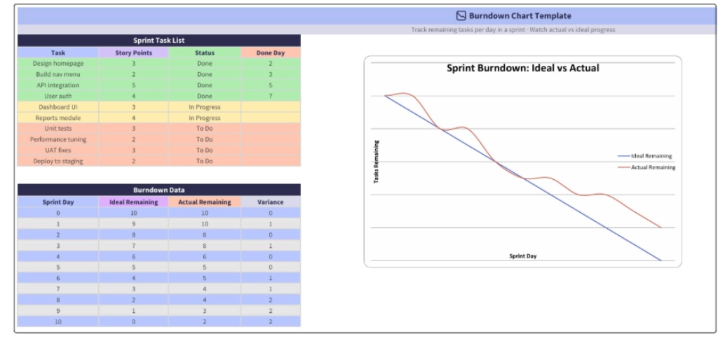
Best For: Software teams, agencies, project managers, and anyone working within fixed timelines. It is also useful for personal monthly or quarterly goals when you want to measure progress against a target completion date.
How to Use: Create a list of all tasks at the beginning of the sprint or planning period. Record the number of remaining tasks each day and update the chart regularly. Compare the actual progress line with the ideal line and take action when the gap starts increasing.
Pros: Provides a clear view of current progress and helps identify potential delays before the deadline arrives.
Cons: Depends on accurate task tracking and consistent updates. An outdated burndown chart can lead to misleading progress information.
8. Mind Map
A Mind Map is a visual time management diagram that starts with a central goal, project, or idea and expands outward into related topics and tasks. Each branch represents a major area of work, while smaller branches break it down into actionable steps. It helps organize thoughts, uncover missing pieces, and simplify complex projects before creating schedules, timelines, or task lists.
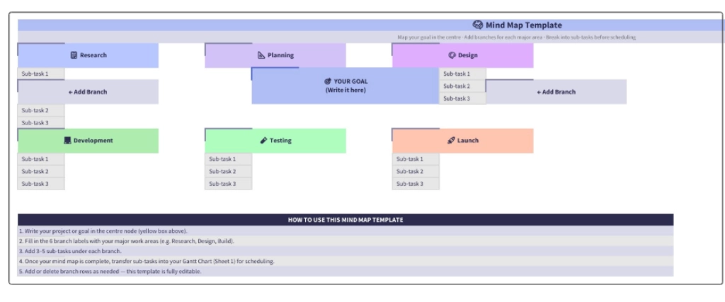
Best For: It is useful for planning long-form content, large initiatives, or goals that require smaller, actionable steps.
How to Use: Place your goal or project at the center of the diagram. Create four to eight main branches for major areas of work, then add smaller branches for specific tasks. Once the map is complete, move the tasks into a project plan, timeline, or task list for execution.
Pros: Helps identify gaps in planning early and makes complex projects easier to organize before work begins.
Cons: Functions as a planning tool rather than a tracking tool. You need to organize tasks into a schedule or task management system before you can track progress and complete the work.
Time Management Chart Comparison: Which One to Use When
Each chart serves a different purpose. Use this quick reference to pick the right chart for your current problem.
| Time Management Chart | Best For | Time to Set Up |
|---|---|---|
| Gantt Chart | Project timelines with dependencies | 30 to 60 minutes |
| Calendar Heatmap | Spotting weekly patterns over months | 4 weeks of tracking + 10 minutes |
| Weekly Time Map | Designing a sustainable weekly routine | 30 minutes weekly |
| Time Audit Pie Chart | Diagnosing where your time actually goes | 1 week of tracking + 15 minutes |
| Habit Tracker Grid | Building productivity habits | 5 minutes setup, daily updates |
| Energy Curve Chart | Scheduling deep work at peak hours | 2 weeks of tracking + 20 minutes |
| Burndown Chart | Tracking sprint or project progress | 15 minutes setup, daily updates |
| Mind Map | Planning before scheduling | 30 to 60 minutes one-time |
Before you choose, check out the Eisenhower Matrix guide to confirm whether your underlying problem is a prioritization issue rather than a visualization gap. Some situations need better decisions before they need a better chart.
Simplify Time Management Effortlessly with Time Champ
Creating charts manually in spreadsheets takes time and often depends on incomplete information. Teams miss tasks, updates become inconsistent, and charts quickly lose accuracy. Instead of spending hours collecting data and updating formulas, you can use Time Champ to manage time effectively and generate insights directly from actual work activity.
Time Champ is an employee monitoring and time tracking software that automatically records work activity, helping you stay organized without maintaining manual logs or spreadsheets.
- Automatic Time Tracking: Track work hours, active time, idle time, and task duration automatically. This helps you clearly see how teams use time throughout the day without manual entries.
- Productivity Analytics: Measure productive and non-productive time, review work patterns, and identify areas where you can improve focus and time utilization.
- Project and Task Tracking: Monitor task progress, project timelines, and completion status in real time so you always know what is moving forward and what needs attention.
- Activity Timeline: Review a complete timeline of daily work activity to see when work started, which applications teams used, and how teams allocated time across different tasks.
- Real Time Monitoring: Get real-time visibility into ongoing work activity, allowing you to quickly identify delays, workload changes, or productivity issues without waiting for manual updates.
- Attendance and Work Hour Reports: Access detailed attendance records, work hours, and utilization reports to monitor consistency and improve workforce planning.
- Custom Reports and Dashboards: Generate detailed reports based on projects, teams, departments, or custom date ranges, making it easier to review performance and support better decisions.
Instead of spending time maintaining separate planners, trackers, or spreadsheets, Time Champ gives you the visibility needed to manage your work more effectively. It brings all your work data together in one place, making it easier to track time, monitor progress, and stay productive without switching between multiple tools.
Struggling to understand where time is going?
Start using Time Champ to simplify time management and make every work hour count.
Conclusion
The right time management chart can turn scattered tasks, schedules, and goals into a clear plan of action. Each chart serves a different purpose, whether you want to organize projects, improve daily routines, monitor progress, or understand how you spend your time. The key is choosing a chart that matches your current challenge and using it consistently. As your needs evolve, combining multiple charts can provide deeper visibility into your workflow and help you make more informed decisions about how you manage your time.

Thasleem Shaik
Table of Content
 What Is a Time Management Chart?
- 8 Visual Time Management Charts to Plan, Track, and Improve Your Time
- Time Management Chart Comparison: Which One to Use When
- Simplify Time Management Effortlessly with Time Champ
- Conclusion
Related Blogs
Download free freelance timesheet templates to track billable hours, manage projects, improve productivity, and simplify time management for freelance work.
Anjali | May 29, 2026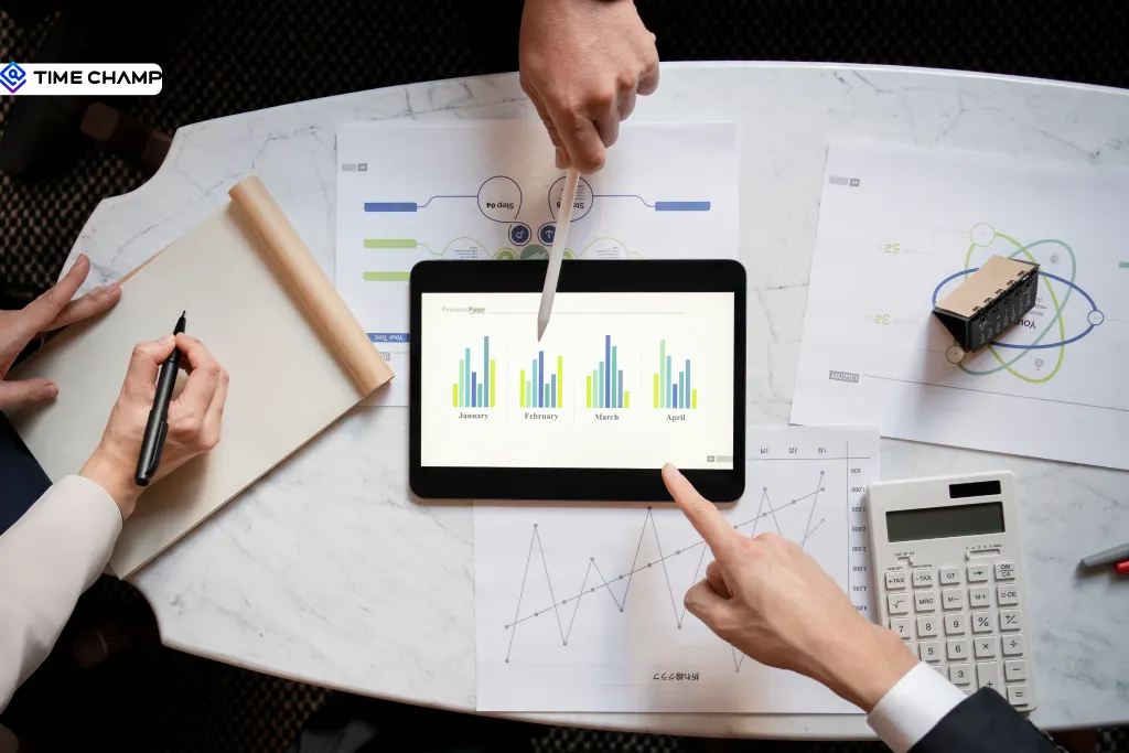
Learn how to measure the ROI of digital time tracking software with a practical cost benefit analysis template for productivity and cost savings.
Jahnavi Pulluri | May 15, 2026Download our professional time tracking discrepancies template to identify, report, and resolve timesheet and attendance mismatches efficiently.
Jahnavi Pulluri | May 14, 2026
Discover 5 free team charter templates in Excel, Word, and PDF to define team goals, clarify roles, improve alignment, and manage projects more efficiently.
Anjali | Apr 08, 2026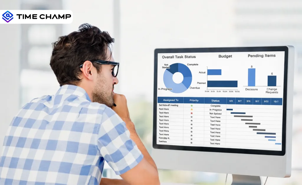
Download free capacity planning templates in Excel, Word, and PDF to plan workloads, balance team capacity, and manage resources with clarity.
Thasleem Shaik | Apr 03, 2026
Looking for a time off request form? Download PTO, vacation, and employee leave request templates in Excel, Word, and PDF formats for free!
Guna Lakshmi | Jun 04, 2026Ready to Manage Your Workforce Smarter?
Join our family of 1100+ companies using smart insights to redefine workforces!
Free Trial
No Credit Card Required