How to Analyze Productivity Data and Build Better Reports
Learn how to analyze productivity data, identify patterns, avoid common mistakes, and build reports that turn insights into clear, actionable decisions.

Productivity dashboards continue to expand with more charts, more metrics, and more frequent updates, yet decisions often remain unclear. The challenge does not come from a lack of data, but from the inability to interpret it correctly. Productivity reports and workforce analytics tools present numbers, trends, and activity levels, but without the right approach, they only describe what happened instead of explaining why it happened or what should change next. This gap between data and direction leads to repeated reviews, unclear priorities, and decisions based on assumptions rather than evidence.
The real value comes from turning productivity data analysis into clear action. Strong productivity metrics analysis helps connect patterns with outcomes, making it easier to understand performance, identify issues, and decide what to change, improve, or continue. This guide explains how to analyze productivity data using a structured approach and how to build reports that clearly highlight key insights. It helps translate data into decisions that improve clarity, performance, and overall results.
Why is “Looking at the Dashboard” Not the Same as Analyzing Productivity Data?
Most teams already have a productivity dashboard. They check it, scroll through it, mention a number in a meeting, and move on. That habit feels productive, but it does not qualify as productivity data analysis. A clear difference exists between seeing data and understanding it, and that gap drives poor decisions. Teams read numbers, assume meaning, and act without verifying the cause.
Many teams stop reading data and fail to go deeper. According to Gallup’s State of the Global Workplace report, only 21% of employees worldwide stay engaged at work, which results in about $438 billion in lost productivity. A large part of this loss comes from misreading data. Teams often fail to distinguish between a productivity dip caused by burnout, a broken process, or a temporary slowdown. They interpret the numbers incorrectly, make the wrong call, and the outcome affects performance. The fix is not a better dashboard. It is a better habit to know what you do after the chart loads. The five-step framework in the next section gives you exactly what you need.
The Five-Step Framework to Analyze Productivity Data
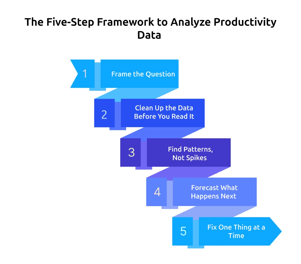
Effective productivity data analysis follows a clear sequence that turns raw numbers into decisions. Without a structured approach, it is easy to jump between charts, focus on the wrong signals, and draw incorrect conclusions. This framework gives a simple way to move from observation to action, so every review leads to a clear outcome instead of another discussion.
Step 1: Frame the Question Before Opening the Dashboard
Before opening any dashboard, write down the specific question that needs an answer. Strong questions sound like these
- "Are my Q4 deliverables at risk based on current capacity?"
- "Which team is closest to burnout, and which signals indicate that?"
- "Where is the utilization rate dropping below what is required to stay profitable?"
- "Which projects are taking more time than the original estimate?"
Apply the "so what" test to the question. If it does not lead to a clear action, refine it. "How is the team doing?" does not help move forward. "Should work be redistributed between Project A and Project B in the next two weeks?" creates direction.
Step 2: Clean Up the Data Before You Read It
Productivity dashboards show everything, but analysis needs focus. Narrow the data before interpreting it by applying four key filters.
- Time window: Use a relevant timeframe, avoid single-day data
- Scope: Define level, avoid mixing different levels
- Comparison: Always compare with baseline, target, or period
- Exclusions: Remove non-working data, like leave or training
Applying these steps early keeps productivity data analysis clear and prevents common mistakes.
Step 3: Find Patterns, Not Spikes
Single-day changes attract attention, but they rarely tell the full story. Real insights come from patterns that repeat over time. Look at data across a meaningful period, such as five working days for an individual, ten for a team, or four weeks for a trend. Compare across time, teams, or targets to understand what is actually changing. This approach helps identify consistent productivity data patterns instead of reacting to short-term fluctuations.
Step 4: Forecast What Happens Next
Analysis should not stop explaining the past. It should guide what comes next. Once a pattern becomes clear, think ahead. Will the current trend affect delivery timelines? Will it create overload or slow progress? This step turns observation into planning and keeps decisions proactive.
Step 5: Fix One Thing at a Time
Acting on multiple changes at once makes it hard to measure what worked. Apply one change, track the result, and then move to the next. This method keeps decisions controlled and measurable. It also strengthens the quality of future productivity reports, since each action links clearly to an outcome.
Following this five-step approach keeps analysis consistent, reduces guesswork, and helps turn data into clear decisions every time.
Confusing data slows decisions and weakens productivity outcomes.
Use Time Champ to turn productivity data analysis into clear insights and faster actions.
The Pattern Library: Seven Productivity Data Patterns You Should Recognize
Productivity data often repeats the same patterns across different teams and time periods. Once these patterns become clear, it becomes easier to interpret productivity data analysis correctly and avoid wrong conclusions. Each pattern below shows how the data appears, what it likely indicates, and what to check before taking action.
Pattern 1: High Active Hours and Falling Output
Working hours extend beyond nine or ten hours, and productive time remains stable or even increases, but task completion and deliverable counts continue to decline. This pattern shows that effort is present, but output does not align with the time spent.
This often indicates overload or fatigue affecting performance. Review workload distribution, check whether priorities are clear, and confirm if adequate breaks have been taken, as these changes help restore consistent output.
Pattern 2: Stable Hours and Falling Productive Percentage
The team records the same amount of time every week, but more of it goes toward non-productive apps, meetings, or admin tasks, which reduces the productive percentage. This pattern shows that effort remains consistent, but low-value activities take more time and reduce overall output.
This usually indicates scope creep or process issues rather than disengagement. Review meeting loads, tools in use, and how often this team member handles urgent work outside assigned responsibilities, as improving these areas helps bring focus back to productive tasks.
Pattern 3: Spiky Productivity with High and Low Days
Productive percentage runs very high on certain days and very low on others, following a consistent weekly pattern. This usually happens when meeting clusters break focus time, especially when the calendar fills with fragmented 30-minute meetings that interrupt deep work.
Run a calendar audit before taking action. Check which days carry the highest meeting load, identify recurring meetings that no longer add value, and review whether the schedule includes dedicated blocks for uninterrupted work.
Pattern 4: One Outlier on a High-Performing Team
Nine out of ten team members maintain 75% or higher productivity, while one remains at 45%. This difference usually comes from project misalignment, lack of proper tool access, or a communication gap rather than a performance issue.
Before acting on the metric, review the type of work assigned to this team member, check if they are going through a transition period, and revisit points discussed in the last one-on-one. Avoid treating this as a discipline issue until the actual cause becomes clear.
Pattern 5: Team-Wide Drop After a Process Change
A clear drop appears across all team members within two weeks after a new tool, workflow change, or reorganization, such as updates in roles, responsibilities, or reporting structure. This pattern shows that the change has disrupted the current way of working, and the team needs time to adjust to the new setup.
Before taking action, review training quality, check whether documentation is clear, and understand where team members go when they get stuck. Focus on improving enablement instead of reversing the change.
Pattern 6: High Output with Low Engagement Signals
Deliverables continue on time, while collaboration time reduces, team communication slows down, working hours become shorter, and meeting participation drops. Output remains steady, but involvement and interaction start to decline.
This pattern signals early disengagement, where work continues but interest and participation reduce over time. Check when the last career discussion happened, review whether recent achievements received recognition, and look at internal growth opportunities that may not be visible.
Pattern 7: Productivity Up, Quality Down
Tasks close faster, but defect rates, rework requests, or complaints increase during the same period. This pattern shows that the team completes more tasks, but skips important steps that affect quality and accuracy.
This situation usually comes from pressure to meet targets, which leads to shortcuts in the process. Review whether deadlines are realistic, check if quality standards have become less strict, and verify if review or QA stages are getting skipped because the workload feels too high. Completing more work without maintaining quality creates long-term issues and reduces overall performance.
How to Build a Productivity Report That Drives Action?
Most productivity reports focus on displaying data instead of guiding decisions. They start with charts, add more charts, and leave the next step unclear. This creates a delay because the report does not answer a specific question or point to a clear action. To build a report that leads to decisions, follow these key principles:
Principle 1: Open with the Question, Not the Data
Start every report with the question it answers. Keep it in one clear sentence such as “This report answers (question) for (team or period).” If the question feels long or unclear, refine it until it leads to a specific decision.
Principle 2: Lead with the Pattern, Not the Dashboard
Show the main insight first. If a specific day or activity affects performance, present that pattern directly instead of showing a general dashboard view. Keep detailed breakdowns in the appendix, so the main report stays focused.
Compare Every Metric, Never Show a Number Alone
A standalone productive percentage number tells you nothing. That same number compared to last month, the team average, or a set target tells you something actionable. Every metric in the report needs at least one comparison axis. If a number has no comparison, either add one or cut the number from the report.
Principle 4: End with a Clear Recommendation
Do not leave the report open-ended. Add a specific recommendation that defines what to change, how long to test it, and which metric to track again. This helps move from analysis to action without confusion.
A Sample Report Structure (Five-slide Format)
The cleanest productivity report fits in five sections.
- Slide 1: The question this report answers, in one sentence
- Slide 2: The headline finding, one chart with one sentence of interpretation
- Slide 3: The pattern explanation, what is driving the headline number
- Slide 4: The recommendation, a specific next step, a timeframe, and the metric to re-measure
- Slide 5: Appendix with supporting data for anyone who wants to review the detail
A shorter report with clear direction helps take action faster than a long report filled with data, but no conclusion.
Scattered data makes productivity harder to understand.
Use Time Champ to build productivity reports that lead to faster, confident decisions.
The Five Most Common Productivity Data Misreadings (And How to Avoid Them)
Even a solid analysis framework breaks down when you misread the data going into it. These five mistakes show repeatedly across teams, and each one leads to an intervention aimed at the wrong cause.
1. Confusing Activity with Output
High active hours often get treated as high productivity, but time spent does not always translate into results. Relying only on activity data can create a false sense of performance. Check deliverables, output quality, and completion rates along with time spent to understand actual performance.
2. Judging Individuals Using Team Metrics
Team-level metrics like utilization rate or average focus time do not reflect individual performance accurately. Using them for individual evaluation leads to incorrect conclusions. Review individual data in its own context and compare it with relevant benchmarks instead of team averages.
3. Ignoring Context in the Data
Productivity numbers without context can mislead decisions. Factors like leave, onboarding, training, or project transitions affect performance. Always account for these conditions or exclude them before interpreting the data to avoid incorrect assumptions.
4. Treating Short-Term Changes as Trends
A single bad day or a sudden spike often leads to quick reactions, but short-term changes do not represent a pattern. Analyze data over a meaningful period, such as multiple days or weeks, before drawing conclusions to avoid unnecessary actions.
5. Comparing Across Different Roles
Comparing productivity metrics across different roles leads to misleading conclusions because work patterns vary by function. A developer, designer, or support role operates differently. Compare similar roles or use role-specific benchmarks to maintain accuracy.
Does Time Champ Make Productivity Analysis Faster and Clearer?
Most productivity data analysis slows down because data stays spread across different tools. You pull numbers from multiple sources, build comparisons manually, and still struggle to confirm whether a pattern is consistent or temporary. Time Champ is an employee monitoring software with built-in workforce intelligence that simplifies this process. The platform shows heat maps that highlight weekly and monthly productivity data patterns, provides real-time dashboards across day, week, and month views, and sends burnout alerts so early warning signs become visible. Each team member can view their own productivity data, which reduces privacy concerns and improves accuracy as individuals identify and correct errors quickly.
The platform covers individual, team, and department-level views in a single click, so switching from a utilization rate comparison to a focus time breakdown takes seconds rather than a manual export. The platform supports deeper analysis within the same system, so there is no need to rely on separate tools. This makes it easier to convert productivity reports into clear decisions and take the right next step without delay. If your bottleneck is turning productivity reports into clear actions, Time Champ is built to close the gap between the dashboard and the decision.
Conclusion
Productivity data becomes valuable only when it leads to clear decisions. Simply reviewing dashboards or tracking numbers does not improve outcomes unless you analyze productivity data with the right approach. By following a structured method, identifying patterns, avoiding common misreadings, and building focused productivity reports, it becomes easier to understand what is happening and what needs to change. Consistent productivity data analysis helps connect effort with results and supports better decisions that improve performance over time.
Productivity improves when decisions get clearer.
Use Time Champ to turn insights into actions that drive real outcomes.

Thasleem Shaik
Table of Content
-
 Why is “Looking at the Dashboard” Not the Same as Analyzing Productivity Data?
-
The Five-Step Framework to Analyze Productivity Data
-
The Pattern Library: Seven Productivity Data Patterns You Should Recognize
-
How to Build a Productivity Report That Drives Action?
-
The Five Most Common Productivity Data Misreadings (And How to Avoid Them)
-
Does Time Champ Make Productivity Analysis Faster and Clearer?
-
Conclusion
Related Blogs
Align employee performance with productivity tracking using a practical framework, clear metrics, and a 90-day plan to turn your data into measurable growth.
Jahnavi Pulluri | Apr 30, 2026Implement a productivity tracking tool with clear steps, setup tips, and best practices to track employee productivity and improve team performance.
Thasleem Shaik | Apr 30, 2026
Track the right remote worker productivity metrics to understand performance, improve output, and avoid micromanagement with clear insights.
Thasleem Shaik | Apr 24, 2026
Understand monitoring reports vs performance reviews, key differences, and how to use both for better performance decisions and team clarity.
Thasleem Shaik | Apr 23, 2026
Apply the OKR framework to boost employee productivity with clear goals, aligned teams, and measurable progress you can track weekly.
Guna Lakshmi | Apr 22, 2026
Track the right employee monitoring metrics to understand work patterns, improve performance, and make data-driven decisions with confidence.
Thasleem Shaik | Apr 22, 2026Ready to Manage Your Workforce Smarter?
Join our family of 1500+ companies using smart insights to redefine workforces!
Free Trial
No Credit Card Required