10 Essential Employee Monitoring Metrics to Track
Track the right employee monitoring metrics to understand work patterns, improve performance, and make data-driven decisions with confidence.

Employee monitoring metrics often become confusing when you track everything without clear priorities. Without that clarity, decisions start depending on assumptions or disconnected reports. It becomes difficult to identify performance issues early, balance workloads properly, or understand where delays actually begin. Over time, productivity gaps remain hidden, top-performing employees do not receive proper recognition, and accountability starts weakening across teams, especially in remote and hybrid work environments.
When you focus on the right metrics, visibility into work patterns, efficiency, engagement, and outcomes becomes accurate and reliable without unnecessary oversight. This blog outlines 10 essential employee monitoring metrics that focus on measurable and actionable insights. These metrics help you make informed decisions, improve performance fairly, and build a structured approach to workforce management while maintaining transparency and trust.
What Are Employee Monitoring Metrics?
Employee monitoring metrics are specific data points used to understand how work actually happens across your teams. These metrics focus on measurable aspects like time usage, task progress, activity levels, and output, helping you see how effort translates into results in day-to-day work.
Instead of relying on assumptions or scattered reports, these metrics provide a systematic approach to measuring performance, identifying gaps, and gaining insights into workflow trends. When used correctly, employee monitoring metrics help you move from raw activity data to clear, actionable insights that support better decisions and consistent outcomes.
What are the 10 Essential Employee Monitoring Metrics?
The table below gives you a quick reference for all 10 employee monitoring metrics, what each one measures, and the point at which it needs your attention. You will find a detailed explanation for each metric after the table.
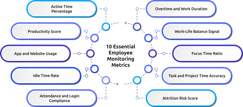
| S.No. | Metric | What It Measures | Action Threshold |
|---|---|---|---|
| 1 | Active time percentage | Share of work session spent on productive apps vs idle or non-work activity | Investigate if sustained below 50% for 3+ consecutive days |
| 2 | Productivity score | Role-based app classification converted to a comparable score per employee | Review workload if score declines for 3+ consecutive weeks |
| 3 | App and website usage | How time spreads across applications by category during work sessions | Address if time consistently shifts to non-work or social apps |
| 4 | Idle time rate | Percentage of session time with no keyboard or mouse activity | Investigate task clarity or disengagement if consistently above 30% |
| 5 | Attendance and login compliance | Match between scheduled shift start and actual login times | Follow up if late logins appear on 3+ days per week |
| 6 | Overtime and session length | Average session duration versus contracted hours per employee | Redistribute workload if sessions run 1+ hours over contracted hours weekly |
| 7 | Work-life balance signal | Ratio of productive work within contracted hours versus outside them | Intervene if productive time consistently shifts to evenings or weekends |
| 8 | Focus time ratio | Uninterrupted productive work blocks above a minimum session threshold | Review meeting load if fewer than 2 focus blocks per day for deep work roles |
| 9 | Task and project time accuracy | Actual time spent on tasks versus estimated time at the task level | Improve estimation or check the scope if overruns exceed 20% consistently |
| 10 | Attrition risk score | Composite behavioral score combining overutilization, disengagement, and burnout signals | Schedule an HR check-in if the score rises consistently over 4+ consecutive weeks |
1. Active Time Percentage
Active time percentage shows how much of a work session your team spends on productive applications based on a defined activity threshold. You calculate it by dividing productive active time by total session time. For example, an eight-hour session with a 55% active time score reflects around four and a half hours of focused work.
- Healthy Signal: 65% and above for roles such as software development, design, and analysis work that require sustained focus. Roles with frequent task switching, such as support or coordination, may show slightly lower values.
- Warning Signal: Active time stays below 50% for three or more consecutive days. This pattern indicates consistent underutilization of work hours and needs attention.
- When to Act: Review the app usage breakdown for that employee to understand how session time spreads across tools and tasks. Check whether time goes into non-work tools, repeated task switching, unclear assignments, or delays in execution. Each situation needs a different corrective step.
2. Productivity Score
Productivity score converts activity data into a clear, comparable number for each employee. It classifies every application as productive, non-productive, or neutral based on the role. For example, time in a code editor counts as productive for a developer, while time on a streaming platform during work hours does not. This score reflects how effectively you use work time, not just how many hours you log.
- Healthy Signal: A stable score at or above the team baseline, with week-over-week variation under 5 points in either direction.
- Warning Signal: A score that declines for three or more consecutive weeks, regardless of its absolute value. A score dropping from 72% to 64% over four weeks is more concerning than a stable score sitting at 60%.
- When to Act: Have a direct conversation with the employee. Show them their own timeline data and ask what has changed. Look for factors such as increased workload, unclear priorities, or external challenges, then address the root cause with clear adjustments.
3. App and Website Usage
App and website usage shows how work session time spreads across different applications and websites by category. Your activity tracking tool captures time per application with role-based classification. This breakdown helps you see which tools your team uses regularly and whether those tools align with the work they need to complete.
- Healthy Signal: Most session time stays concentrated in two or three core applications specific to the role, with normal variation for communication tools and collaborative work.
- Warning Signal: Consistent time in social media, entertainment, or personal shopping sites during working hours, or unusually low usage of core work tools, which suggests tasks are not getting worked on.
- When to Act: Check whether the issue comes from difficulty using a required tool or a lack of focus during work hours. If the tool feels difficult to use, provide proper guidance or support. If attention shifts away from work, set clear expectations and address the behavior directly.
4. Idle Time Rate
Idle time rate tells you how much of a work session your team stays inactive while still logged in. It tracks periods where no keyboard or mouse activity happens and calculates what percentage of the total session this inactivity takes. This metric helps you see how often work stops during the day instead of moving forward.
- Healthy Signal: Idle time stays under 20% for roles that require continuous focus, such as development, design, or analysis. Short inactive periods during reading, thinking, or quick breaks between tasks remain normal.
- Warning Signal: Idle time stays above 30% across multiple sessions in the same week. When it crosses 40%, it shows that a large part of the workday goes without active engagement.
- When to Act: Find out why inactive time increases. Check if tasks are unclear, if work stops while waiting for approvals or inputs, if system or tool issues slow progress, or if attention shifts away from work. Each cause needs a different action to fix it.
5. Attendance and Login Compliance
Automated attendance tracking captures login and logout times directly from session activity and compares them to each employee's scheduled shift. It flags late logins, early logouts, and missed check-ins automatically, without any manual review on your end.
- Healthy Signal: Logins stay consistent with assigned shift timings, with small variations for time zone differences, scheduled meetings, or approved flexible hours.
- Warning Signal: Late logins appear on three or more days in the same week, or login time gradually shifts without approval. In remote setups, this often indicates a change in engagement or routine.
- When to Act: Identify whether the issue comes from a mismatch between the assigned shift and actual productive hours or from a change in behavior. If the schedule does not align with work patterns, adjust it. If the issue relates to consistency or discipline, address it directly with clear expectations.
6. Overtime and Session Length
Overtime tracking compares planned work hours with the actual time spent working each day. It shows who regularly works beyond scheduled hours and how often it happens. This helps you understand workload balance and identify early signs of burnout.
- Healthy Signal: Work stays close to assigned working hours, with occasional extra time during peak workloads and reduced hours on lighter days.
- Warning Signal: Work hours exceed the assigned schedule by a large margin week after week. This pattern reflects sustained workload pressure and early signs of burnout, not higher productivity.
- When to Act: Review workload and redistribute tasks. Continuous overwork affects output quality and increases the risk of burnout.
7. Work-Life Balance Signal
Work-life balance tracking shows when productive work happens during the day and how much of it extends beyond regular work hours. It highlights whether work stays within defined hours or shifts into evenings and weekends. It gives you a clear view of whether work stays balanced or starts affecting personal time.
- Healthy Signal: Most productive work happens within regular work hours, with minimal activity extending beyond scheduled time.
- Warning Signal: Productive work often continues into evenings or weekends, or a growing share of work moves outside regular hours over multiple weeks.
- When to Act: Review workload and timing. Check if tasks fit within available hours or if work patterns need adjustment to bring balance back.
8. Focus Time Ratio
Focus time ratio measures how much of a work session your team spends in uninterrupted productive blocks above a set minimum duration, usually 90 minutes. It shows whether work happens in long, consistent stretches or breaks into short segments due to interruptions. Focus time ratio matters most for roles that require sustained concentration, such as developers, analysts, writers, and designers.
- Healthy Signal: At least two uninterrupted focus blocks in a day for roles that require deep concentration, while the rest of the time goes into collaboration and communication tasks.
- Warning Signal: No focus blocks above the set threshold across multiple days. Frequent interruptions or inactive periods break work into short 15-to-20-minute segments.
- When to Act: Review the employee's meeting load and notification habits. Excessive meetings, constant chat interruptions, and unclear task priorities often break focus and prevent longer, uninterrupted work periods.
9. Task and Project Time Accuracy
Task and project time accuracy measures the gap between the time your team estimated for a task and the time they actually spent on it. Automated time tracking captures actual task-level hours without requiring manual timesheets, making it easy to compare planned time with actual effort.
- Healthy Signal: Actual time stays within 15 to 20% of the estimate across the team. Small variation is normal. Consistent alignment in this range shows that estimates reflect real effort.
- Warning Signal: Actual time exceeds estimates by more than 20% across the team, or tasks finish much earlier than expected because work does not reach completion. These patterns usually indicate issues in planning or scope rather than individual performance.
- When to Act: Use this data in the next planning session. When overruns happen consistently, estimates do not match the actual scope. Fix the planning approach instead of treating it as a performance issue.
10. Attrition Risk Score
Attrition risk score combines multiple employee monitoring metrics such as overutilization, declining productivity, increasing idle time, work-life imbalance, and disengagement patterns into a single score for each employee. This score highlights situations where individual metrics may not raise concern on their own, but when viewed together, they indicate a growing risk of disengagement or a possible decision to leave.
- Healthy Signal: The score remains stable without a sustained upward trend, indicating consistent work patterns and normal working activity.
- Warning Signal: A rising attrition risk score over four or more consecutive weeks, especially when combined with declining productivity scores and a deteriorating work-life balance signal.
- When to Act: Start a check-in early, before the employee reaches a decision to leave. Review workload, expectations, and current challenges, then discuss career direction and support. Acting at the stage where the score begins to rise gives you a real opportunity to correct issues and retain the employee.
Get complete clarity on how time, effort, and output align across your team.
Track the right monitoring metrics with Time Champ and act with confidence.
How to Interpret Employee Monitoring Metrics Accurately?
Metrics only become useful when you read them the right way. Without proper interpretation, the same data can lead to wrong conclusions and poor decisions. To get real value from employee monitoring metrics, you need to understand how to read patterns, connect context, and act on what the data actually shows.
- Do Not Read a Single Metric in Isolation: One metric alone does not explain performance. For example, if active time drops but productivity score holds steady, the employee may be using fewer apps more effectively, not slacking. Active time, productivity score, and app usage need to align to show a clear pattern.
- Focus on Patterns, Not One-Time Values: One low or high value does not define performance. Consistent changes across days or weeks reveal what is actually happening. Trends show whether performance improves, declines, or stays stable.
- Always Connect Metrics with Context: Every role works differently. Work that involves planning, collaboration, or frequent switching reflects differently in metrics. Without context, the same number can lead to the wrong conclusion.
- Look for Cause, Not Just Outcome: Metrics show what is happening, not why it is happening. A drop in productivity or a rise in idle time needs further investigation to identify the actual reason behind it.
- Use Metrics to Guide Conversations: Data helps you identify where to look, but clarity comes from discussion. Use metrics as a starting point to ask the right questions and understand what has changed.
- Combine Multiple Metrics Before Taking Action: Decisions should not depend on a single data point. When multiple metrics point in the same direction, the insight becomes reliable and actionable.
Track the Right Monitoring Metrics with Time Champ
Tracking multiple employee metrics across different tools often creates gaps, inconsistencies, and extra effort. An employee monitoring software like Time Champ brings all essential metrics into one place, so you can view active time, productivity, app usage, idle patterns, and workload distribution without switching between systems. This gives you a clear and connected view of how work actually happens across your team.
Instead of working with scattered data, Time Champ helps you read patterns, compare performance, and take action with confidence. Each metric connects with the others, making it easier to understand the full picture and respond at the right time. This structured approach removes guesswork and helps you manage work with clarity and control.
Conclusion
The practice of employee monitoring metrics is only useful when you concentrate on the ones that make sense and clarify how the work flows, where time goes, and where it requires attention. The correct metrics provide you with an organized perspective of performance, workload, and engagement without assumptions. When you track them consistently and interpret them correctly, you gain clarity to make better decisions, fix gaps early, and maintain balance across your team.
Gain clear visibility into what the numbers actually represent.
Use Time Champ to track real work patterns and make decisions backed by data.

Thasleem Shaik
Table of Content
-
 What Are Employee Monitoring Metrics?
-
What are the 10 Essential Employee Monitoring Metrics?
-
How to Interpret Employee Monitoring Metrics Accurately?
-
Track the Right Monitoring Metrics with Time Champ
-
Conclusion
Related Blogs

Explore features of employee monitoring tools, including tracking, security, and productivity insights, to choose the right solution.
Thasleem Shaik | Apr 21, 2026
From AI-powered behavior analytics to no-code workflow builders, explore the top 10 automation trends that are reshaping employee monitoring in 2026.
Shabana Shaik | Apr 21, 2026
Stealth and transparent monitoring work very differently for teams. See the key differences, legal implications, and which approach fits your organization.
Jahnavi Pulluri | Apr 21, 2026
Find out if employee monitoring software is worth it for your small business. See real ROI math, pricing, legal tips, and a 14-day implementation plan.
Jahnavi Pulluri | Apr 21, 2026
Explore employee monitoring software for startup businesses in 2026. Learn how to boost productivity, control costs, and manage remote teams with confidence.
Anjali | Apr 21, 2026The right employee performance tracking software turns activity data into decisions. See what to look for, how to compare, and what works for your team.
Guna Lakshmi | Apr 18, 2026Ready to Manage Your Workforce Smarter?
Join our family of 1500+ companies using smart insights to redefine workforces!
Free Trial
No Credit Card Required