Lifetime Heat Maps or Employee Performance Tracking
See productivity trends at a glance with lifetime heat maps built for employee performance tracking, instantly spotting patterns, gaps, and top performers.
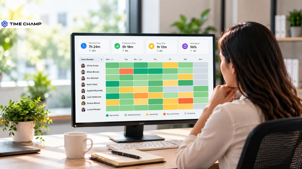
When employee data sits across timesheets, attendance records, and activity reports, you may struggle to spot performance patterns. A single report can show you what happened, but it rarely makes recurring patterns easy to identify. Employee performance tracking becomes more useful when you can see working patterns and productivity changes over time. Lifetime Heat Maps bring these patterns together in a simple visual format, helping you quickly spot productivity peaks, gaps, and changes.
In this blog, you’ll understand how performance heat maps work and which employee metrics they can track. You’ll also learn how to use heat maps to analyze performance and identify meaningful productivity trends.
What Is an Employee Performance Heat Map?
An employee performance heat map is a visual grid that uses color intensity to show changes in employee activity, working time, or productivity. Each cell represents a specific period, making high, low, and recurring performance patterns easier to spot and compare across employees or teams.

Did You Know?
Gallup workplace data shows that only 31% of U.S. employees are engaged at work, while 17% are actively disengaged, highlighting the need for employers to gain clearer visibility into employee work patterns and performance.
Performance Heat Map vs. Productivity Report: What’s the Difference?
Both the performance heat map and productivity report help you evaluate employee performance, but they present information differently. A heat map makes patterns visible through color-coded trends, while a productivity report organizes performance data into detailed metrics. Knowing the difference helps you choose the right view for spotting trends, investigating performance changes, and making informed decisions.
| Difference | Performance Heat Map | Productivity Report |
|---|---|---|
| Primary purpose | Highlights performance patterns and changes visually. | Provides detailed information about employee productivity and work activity. |
| Data presentation | Uses color intensity to make high, low, and changing activity levels easy to spot. | Uses numbers, tables, charts, and summaries to present specific performance data. |
| Pattern identification | Makes recurring productivity patterns, peaks, and gaps easier to recognize at a glance. | Requires reviewing metrics or trends to identify changes over time. |
| Level of detail | Gives a quick visual overview without overwhelming the viewer with numbers. | Provides deeper details such as hours worked, productive time, idle time, and activity levels. |
| Time-based analysis | Makes changes across days, weeks, or other periods easy to compare visually. | Shows time-based trends through reports, charts, or metric comparisons. |
| Best use case | Useful for quickly finding unusual patterns, productivity gaps, and high-activity periods. | Useful for investigating specific metrics and reviewing detailed employee or team performance. |
| Decision-making | Helps you quickly decide where closer attention or further analysis may be needed. | Provides the supporting details needed to investigate performance and plan follow-up actions. |
How Do Employee Activity and Performance Metrics Shape a Heat Map
A heat map turns employee activity and performance data into clear visual patterns, making employee performance tracking more actionable. It helps you spot productivity changes, recurring gaps, and periods that need closer attention. Color intensity makes it easy to compare activity levels across employees and time periods.
Working Time
The amount of time an employee spends actively working during a selected period can reveal important patterns in daily activity. When displayed on a heat map, variations in working hours make it easier to identify consistent schedules, unusually low activity, or periods of increased engagement.
Productive Time
Productive activity reflects the portion of tracked work time spent on tasks or applications that support assigned responsibilities. Reviewing this metric across employees or time periods can help reveal stronger work patterns and identify areas where productivity varies.
Away Time
Away time can help explain changes in activity by showing periods when employees are not actively using their devices or engaging in work. Reviewing these patterns alongside other metrics provides a broader context and helps you distinguish normal breaks from recurring inactivity.
Activity Levels
Activity levels can reveal how employee engagement changes over a selected period. Displaying these variations through different color intensities, a heat map can make higher and lower activity easier to compare, helping you recognize unusual patterns or shifts in work behavior.
Attendance and Leave Patterns
Attendance and leave data can provide additional context for changes in activity or productive time. For example, a lower activity period may align with absences or planned leave without indicating a performance issue.
Time-Based Trends
The value of a heat map increases when you view these metrics across multiple days, weeks, or longer periods. Without just judging performance from one day’s data, you can identify recurring peaks, dips, and changes that may warrant further analysis.
Did You Know?
The U.S. Bureau of Labor Statistics’ Productivity and Costs, First Quarter 2026 report found that nonfarm business labor productivity increased 2.9% year over year, highlighting why productivity should be evaluated alongside hours worked.
How to Analyze Employee Performance Using Heat Maps
A heat map helps you see how employee performance changes over time. It makes it easier to compare trends, spot unusual results, and identify areas that need attention. Use these patterns as a starting point for fairer performance reviews and better workforce decisions.

1. Set a Relevant Time Period
Start by selecting a period that gives you enough data to identify meaningful patterns. Reviewing several days or weeks can reveal recurring productivity peaks or dips that may not be visible in a single day's activity.
2. Look for Consistent Patterns
Focus on recurring patterns and avoid reacting to one unusually high or low period. If similar activity levels appear across multiple days, you have a stronger basis for investigating the underlying work pattern.
3. Identify Productivity Peaks and Gaps
Use differences in color intensity to quickly locate periods of higher or lower activity. Consistently strong periods may reveal when employees or teams are most productive, while recurring low-activity periods can point to workflow interruptions, scheduling issues, or other factors worth investigating.
4. Compare Employees or Teams
Compare similar employees, teams, or work periods to put individual patterns into context. A heat map can help you identify performance differences across groups without relying on a single overall productivity score.
5. Investigate Unusual Changes
Pay closer attention to sudden shifts from an employee’s usual pattern. Treat a sharp drop or increase as a signal for further investigation, not as proof of poor performance. Check related factors such as workload, deadlines, leave, or changes in responsibilities before concluding.
6. Connect Activity with Performance Metrics
Compare heat-map patterns with productive time, working time, task completion, attendance, and other role-specific performance measures. Use these comparisons to build a complete view of performance without relying on activity levels alone. Combine behavioral patterns with relevant performance measures and avoid making decisions based on a single metric.
7. Turn Patterns into Action
Use each meaningful pattern to determine your next step. Adjust workloads, protect peak productivity periods, address workflow bottlenecks, recognize strong performance, or discuss recurring challenges with the employee. Choose the action that best matches the pattern and verify whether it improves the outcome over time.
Finding performance patterns but missing the reasons behind them?
Use heat maps to turn employee activity data into clearer performance insights.
How Does Time Champ Support Employee Performance Tracking
When you manage a distributed or growing team, scattered activity data can make it difficult to see how employees spend their work time and where productivity patterns change. Time Champ is smart employee monitoring software that brings time, activity, productivity, and attendance data into one platform, helping you replace disconnected reports with a clearer view of employee performance. Its Lifetime Heat Maps help you quickly spot productivity trends, work patterns, and recurring gaps.
Here are the key Time Champ features that help you simplify employee performance tracking and gain clearer work insights:
- Lifetime Heat Maps: Provides a visual view of working time, productive time, away time, and leave patterns across days and longer periods. This helps you use the color-coded view to quickly identify productivity peaks, recurring gaps, and changes in work patterns.
- Productivity Tracking: Measures productive hours, focus time, idle time, and application usage for employees and teams. This helps you identify productivity trends and compare performance across different periods.
- Work Activity Tracking: Helps you see how employees use applications and websites during working hours and review activity levels. This gives you additional context when a heat map reveals an unusual productivity pattern.
- Time Tracking: Automatically records work hours and connects time data with projects, tasks, and clients. You can use accurate time records to put productivity patterns into context without relying on manual timesheets.
- Attendance Management: Tracks attendance and work schedules in one place, helping you distinguish genuine performance changes from patterns caused by absences, schedule differences, or leave.
- Productivity Reports: Reviews detailed productivity data alongside visual heat maps when you need more context. This helps you move from spotting a performance pattern to investigating the activity and metrics behind it.
Struggling to spot productivity gaps across your team?
Use Time Champ to track employee performance and uncover actionable work patterns.
Conclusion
Lifetime heat maps make employee performance easier to view by turning work activity into clear, visual patterns. They help you spot productivity trends, recurring gaps, unusual changes, and performance shifts across different periods. Combined with supporting metrics, these insights give you a stronger basis for fair performance reviews and better workforce decisions. Employee performance tracking becomes more effective when you focus on patterns. Use heat maps to identify where attention is needed, investigate the reasons behind changes, and take practical steps to improve productivity. Start turning everyday work data into clearer performance insights today.

Anjali

Table of Content
 What Is an Employee Performance Heat Map?
- Performance Heat Map vs. Productivity Report: What’s the Difference?
- How Do Employee Activity and Performance Metrics Shape a Heat Map
- How to Analyze Employee Performance Using Heat Maps
- How Does Time Champ Support Employee Performance Tracking
- Conclusion
Related Blogs

The right employee performance tracking software turns activity data into decisions. See what to look for, how to compare, and what works for your team.
Guna Lakshmi | Apr 18, 2026
Explore employee performance monitoring types, effective methods, common mistakes, and practical ways to improve overall team performance for modern workplaces.
Anjali | May 08, 2026
Align employee performance with productivity tracking using a practical framework, clear metrics, and a 90-day plan to turn your data into measurable growth.
Jahnavi Pulluri | Apr 30, 2026
Learn how to monitor employee idle time the right way with fair thresholds, transparent policies, and idle time monitoring software that builds trust.
Anjali | Apr 30, 2026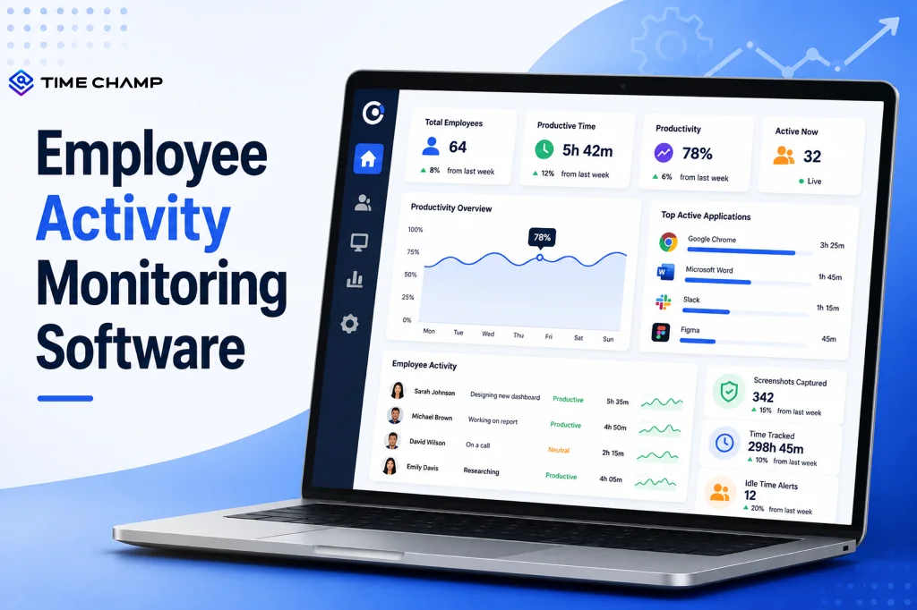
Learn what employee activity monitoring software is, how it works, what data it captures, the main types, legal use, and how it differs from time tracking.
Guna Lakshmi | Jul 28, 2026
Explore top workforce analytics tools for 2026 to monitor productivity, attendance, and team performance in real-time.
Guna Lakshmi | Apr 21, 2026


 4.7/5 avg.
Ready to Manage Your Workforce Smarter?
Join our family of 1500+ companies using smart insights to redefine workforces!

Free Trial
No Credit Card Required