HR Dashboard: Meaning, Metrics, Types, Charts & Examples
An HR dashboard is an effective tool that synthesizes important workforce data into an enticing and visually encouraging format that is straightforward. The goal of an HR dashboard is to provide visibility around people-related trends, metrics, and performance to HR professionals and organizational leaders. The data produced in an HR dashboard is often complex and difficult to understand; however, a strong HR dashboard simplifies this data by using charts, graphs, and summaries.
Usually, the metrics found on HR dashboards include metrics like headcount, turnover, employee absences, gender diversity, training hours, and stages of the hiring funnel. HR dashboards can be put into many different categories, recruiting dashboards, employee engagement dashboards, diversity dashboards, performance management dashboards, etc., which all showcase relevant data to support better decisions that they can control.
An effective HR dashboard helps the organization and HR leaders see trends, better quantify deficiencies and strengths, and enable them to make more informed decisions based upon data to increase productivity and morale of their workforce. HR dashboards can turn basic data into value through simple, easy-to-read charts and examples, depending on their organization to increase productivity and efficiency of the organization.
What is an HR Dashboard?
An HR dashboard is a digital tool that collects, organizes, and visually presents core information about employees (including attendance, hiring, and other workforce trends) in a way that gives managers a quick and complete picture of what is happening in one location.
The goal of an HR dashboard is to make workforce data readily available and easy to visualize for anyone who is involved in managing people. By turning numbers into simple graphs and charts, HR dashboards allow leaders to get fast insight into where there are strengths and where there needs to be additional focus. With access to dashboards, managers can make decisions faster and with higher levels of confidence.
HR dashboards matter because they place the most important employee data at fingertips. By storing everything in one place, managers won't have to waste time trying to find data or pulling numerous reports. This also keeps everyone in the room on the same page, which can lead to faster collaboration with each other on problems that may arise.
One of the biggest advantages of an HR dashboard is the ability to view trends as they are occurring. If staff are leaving at a faster rate of attrition or one project team's attendance is way down for days at a time, those changes get noticed immediately. That early warning allows the organization to adjust to a small problem before it turns into a much larger problem. Talking about the data to share results and celebrate wins in the workplace fosters a greater sense of comfort and depth of positive relations with each other in the workplace. HR dashboards don't just track problems. They reveal the positive things too, like great retention , high engagement, and effective hiring. Seeing positive trajectories and addressing issues before they develop into problems is enhanced greatly by having an intelligent and clear dashboard to help navigate.
What are the Key Metrics Included in the HR Dashboard?
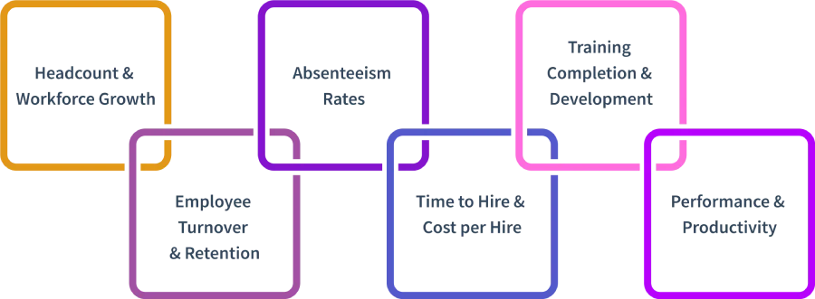
A true modern HR dashboard brings valuable employee data to life by displaying the metrics that define the heart or life of any workplace. Here’s a new twist to the key metrics for every dynamic HR dashboard should include with its side heading for clarity and ease:
Headcount & Workforce Growth
Monitoring headcount does not only mean counting the number of people on a list. Looking at headcount as a measure of change over time helps indicate if, when, and how much change needs to be done. Managing headcount helps identify when to recruit, restructure, or rethink staffing plans.
Employee Turnover & Retention
Turnover metrics identify how many employees are entering and leaving; however, it is the pattern (such as whether good employees are leaving faster than anywhere you hire) that is important. Tracking both turnover and retention metrics permits HR to identify root causes, make improvements for a better workplace , and additionally prevent valuable employees from slipping away from an organization.
Absenteeism Rates
Absenteeism rate quickly identifies if employees are missing work significantly more than expected at any point in time. A spike in absenteeism can typically highlight deeper issues such as burnout , disengagement, or health concerns. If organizations identify peaks in absenteeism early, they can assist employees promptly - for example, providing flex hours or wellness days - before absenteeism becomes a risk to company performance.
Time to Hire & Cost per Hire
Speed and cost are both important factors when growing a team. Tracking how long it takes to fill a role (often referred to as time to hire) and cost per hire signals the effectiveness of your recruitment. Is there a bottleneck? Is an aspect of your recruitment inefficiently costing for something avoidable? What can HR tweak to grow a company further?
Training Completion & Development
People will grow when they are given the right tools. Tracking completion rates of training and commitment to employee development monitors not just whether training opportunities exist, but which ones actually get completed and their practical effectiveness. These benchmarks equip organizations with the knowledge they need to understand where to invest at a quicker rate to close skill gaps and future-proof the business.
Performance & Productivity
Investigating performance reviews, outputs and productivity measures shows the performance of teams or individuals and the opportunity to improve processes. These metrics allow businesses to align workforce performance with strategic company objectives, provide continuous improvement opportunities, and reward high performers.
When a company selects its most important metrics and focuses on aligning them on a single-page dashboard, its HR dashboard. It serves to focus disparate data and put together a story actionably, providing leaders with a platform of certainty on which to make informed decisions and create a workplace where all employees can flourish.
How Many Types of Hr Dashboards are There?
Executive HR Dashboard
An executive HR Dashboard provides company leaders with an overview of all of the major workforce trends in one easy-to-understand snapshot. The executive HR Dashboard contains the big picture data HR provides to leaders: headcount, turnover, salary averages, incumbent locations, and strategic workforce planning HR, KPI and metrics . Here, leaders have what they need at their fingertips to make informed decisions and see where issues and opportunities exist across the organizational horizon.
Employee Performance Dashboard
The employee performance dashboard is driven by how individuals and teams are achieving goals. Performance metrics are collected and tracked to indicate things such as employee productivity, individual accomplishments, customers' experiences and input, and milestones achieved along the way. Managers usually use this dashboard's high-level data and reports to identify top-performing employees, coach those in need of improvement, and analyze overall department-level results and performance cycles.
Employee Development & Training Dashboard
A development and training dashboard is designed for employee development and advancement. HR staff and team leaders use such dashboards to track employees engaged in training, employee completion rates, and skill-building activities. These data points allow the organization to identify the skill gaps to encourage continuous improvement and help with implementation planning on future training with specific data.
Diversity & Demographics Dashboard
A workforce composition dashboard shows the demographics within an organization's workforce measures like gender, age, ethnicity, and other inclusion factors. Learning in regard to these dimensions can allow a business to know how far they've come toward their diversity goals or to see where there may be further representation challenges. The overall goal is to help the organization reflect on all its interventions that support a fair, inclusive workplace.
Recruitment & Hiring Dashboard
Recruitment dashboards help hiring teams understand all recruitment funnel processes. This type of recruitment data is structured, and the performance measures may include the number of open job positions, candidate flow progress, time to fill, cost per hire , or offer acceptance rates. The organization now has the ability to improve the process of recruiting and its performance through all stages.
Workforce Planning & Headcount Dashboard
Workforce planning dashboards provide a real-time view of headcount, new hires, exits, and trends within departments. By revealing the changes in the number of employees and units of productivity (where the workforce is increasing/decreasing), dashboards provide leadership with data to help with budgeting, hiring, and forecasting future talent needs.
Time, Attendance & Absenteeism Dashboard
Workforce dashboards enable businesses to monitor, in a variety of ways, when and how frequently employees are at work, and when they are not at work. The measures include attendance, absences, overtime , paid leaves, and any trends that could indicate interesting patterns of behaviors. They easily reveal patterns in attendance, enabling HR response when attendance issues arise.
What are Some Examples of HR Dashboards?
HR dashboards available come in a mixture of dashboards, each tailored to give management quick insights into one segment of the workforce. Here are some common practical applications seen in organizations:
Executive HR Dashboard
This dashboard provides leaders with a broad overview of all of the essential workforce metrics—such as headcount, employee location , average wages, and gender ratio as well as employee satisfaction and turnover rates. It is perfect for managers that want a quick and precise pulse on the health of its people before needing to make strategic changes.
Employee Performance Dashboard
This dashboard is used by managers and HR to track how individuals and teams are making progress against their goals. It includes indicators like productivity levels, tasks completed, quality of work, goals achieved, peer feedback and performance ratings. It helps management identify the star performers, training gaps, and coaching or training needs.
Recruitment or Hiring Dashboard
This dashboard identifies the efficiency and effectiveness of the hiring process. It would detail positions open, candidate pipeline status, time to hire, where candidates are sourced, diversity of applicant pool, and whether a candidate accepted an offer or not. The HR team can use this information to develop new recruitment strategies and assess how quickly they can make hiring decisions.
Employee Development & Training Dashboard
This dashboard tells you about training engagement, hours completed, costs and skills acquired as well as non-completion rates of learning programs. Organizations use this information to identify skill gaps and inform future training spend.
Turnover & Retention Dashboard
This dashboard has focused on turnover, why employees have left, and how long employees stayed or may stay. It displays turnover by demographics, department, or tenure, reasons for leaving, and keep rates. The dashboard will allow the organization to receive early warnings on employee retention challenges and be utilized for developing employee retention strategies.
Employee Engagement Dashboard
The dashboard measures employee engagement via engagement survey data, participation rates in feedback sessions, wellness program utilization, and internal mobility. These statistics suggest a customer’s relationship with their employees which directly relates to how high levels of morale and culture are sustained at high levels.
Each dashboard is available for further customization to meet a company’s specific needs. Organizations can mix various charts to display meaningful, real-time data that can be easier to interpret. The example dashboards may assist HR teams and HR leadership teams with making better decisions, being more transparent to employees and promoting an overall healthy and productive workplace.
How Does a Human Resources Dashboard Help in HR Management?
A Human Resources dashboard will make policies more user friendly by consolidating valuable employee information and data in visual format (i.e., charts and graphs) on areas like attendance, turnover, hiring progress, and employee engagements so they are easy for HR professionals/managers/leadership to quickly identify workforce trends and make decisions with easy access to information without spending hours searching through data and reports . Employees receiving engagement feedback surveys, or turnover reports mark themes of change. A dashboard can provide real time data so organizations can view emerging conditions that may potentially hinder employee engagement such as high absenteeism rates or rising turnover rates.
Further, an HR dashboard promotes communication and transparency to the wider business. It allows leaders to communicate key metrics with teams and set concrete tracking goals.
What are the Best Human Resources Graphs to Use in an HR Dashboard?
The best Human Resources graphs on an HR dashboard are quick visual insights that convert workforce data in a comprehensive and actionable way. Here is a top view of some of the most effective graph types, and examples of what they represent and why they so easily convey information:
1. Bar Charts
Bar charts are one of the most regularly used graph types on HR dashboards, and most effective at demonstrating comparisons between categories, using human resources metrics such as employee count by department, gender preference, job level or geographical location. Bar charts quickly demonstrate discrepancies, diversity tracking and the overall turnover or promotional rates of teams.
2. Line Graphs
Line graphs are best for demonstrating change over a period of time; such as absenteeism, turnover and growth of your workforce. Line charts easily demonstrate patterns of times of the year to assist a manager in tracking and recognizing patterns before they become a major issue over time.
3. Pie Charts
Pie charts are a clear representation of parts of a whole; due to this characteristic, they are particularly useful to visualize composition in the workforce. For example, a pie chart can provide a visual representation of the company’s gender, age, or full, part-time participants. If you want to help the reader visually understand how different parts are represented in the company, creating a pie chart is a helpful and intuitive approach.
4. Heat Maps
Heat maps are effective ways to visualize density, intensity, or patterns in data. For example, heat maps provide visual representations of departments where absenteeism is high, or areas where engagement is low. Color gradients in a heat map make it easy for the reader to see at a glance where the biggest opportunities are for you to focus your attention.
5. Stacked Column or Area Charts
Bar column charts are useful in understanding multiple related metrics over time. For instance, a column chart would provide visual representation of headcount growth related to Bar column charts are useful in understanding multiple related metrics over time. For instance, a column chart would provide visual representation of headcount growth related to job type, or new hires and exits side by side. These charts effectively show not only totals, but also how proportions are shifting in your workforce over time.
6. Matrix Charts or Grids
Matrix charts are useful for skills mapping or competency analysis. For example, a matrix chart can describe where skills are represented, missing, or clustered by department in any organization. A matrix chart provides HR teams with a visual representation of where to focus their training or recruitment efforts.
7. Bullet Graphs
Bullet graphs provide a quick glance at progress towards a specific goal, such as training completion rates or satisfaction score targets. Bullet graphs are compact and provide more information than a simple gauge or thermometer-style graphic.
How Can an HR Analytics Dashboard Help with Decision-making?
In an era of HR analytics, an HR analytics dashboard can support decision-making by offering real-time insights and visuals about core HR metrics—which include turnover, performance, recruitment, and training. An HR analytics dashboard allows HR professionals to identify trends, track productivity in regard to employees, and determine whether there are issues in their workforce, such as excessive absenteeism or non-effective retention. Because HR analytics dashboards present HR information in an easily digestible format, HR departments can apply the information to assist in making data-driven decisions about hiring, planning for resources, and developing employees. Ultimately, by establishing and then using an HR analytics dashboard, HR departments can develop a better employee experience, as well as get better value from their cost-limited resources.

Run HR in One Place
Time, attendance, leaves, and payroll-ready reports unified.
Explore HR Management →Productivity Starts With Visibility - Time Champ Gives You Both!
Book Your Free Demo